Industry Spotlight: Bendigo Accountant Websites - Part 2
And now for the Not-so-good websites. Not that there’s anything wrong with the accountants… just that their websites fall below what would be considered acceptable standards.
Room for improvement:
P.A. McConnachie

What I like:
- Clean when viewed as Desktop site
- Loads in a second! - 40k payload, 15 requests. That’s pretty awesome really.
Could improve:
- Not responsive. That’s pretty much an essential these days. It’s unpleasant on mobile.
- Flash in the banner? Why?
- A randimages.js doesn’t load (just 404s).. probably for the best.
- No favicon. They’re just a nice touch to have.
- Content out of date, doesn’t look like it’s been updated for a couple of years at least.
Bendigo Accounting & Finance
www.bendigoaccountingandfinance.com.au

What I like:
- Is responsive, but kind of weirdly so. Displays different content to mobile users (compared to desktop) and doesn’t make as much sense.
- Build using webs.com - nice toolset/CDN to deliver pages
Could improve:
- 111 requests, 1.7Meg, 6 seconds to load. Well, it’s fast-ish, thanks to the CDN. But that’s a crazy number of requests.
- Font choice is odd.
- I just couldn’t gel with this site. I want to like it, because it shows character. But subjectively I really struggle with the site.
- Dynamic menu in desktop mode is a bit painful.
- Same image carousel on homepage is just odd. (different text, but same image. Just weird transition/animation I guess)
KGM Accounting
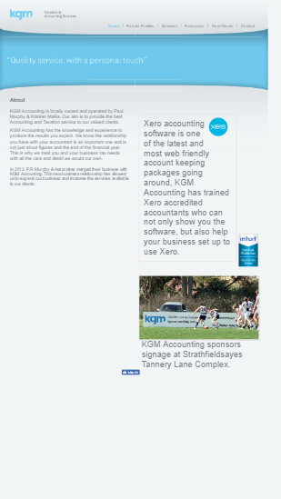
What I like:
- Really fast delivery. 27 requests, 255k delivered in 627ms. That’s quick! (Runs on lightspeed web server. )
- Clean light html pages. Really well managed server too, it looks like.
- Excellent content. Who doesn’t love Xero?
Could improve:
- Responsive site for mobile use would be great.
- The new clients form is about as ugly as it gets. Just some basic styling there would help.
- The overall design isn’t great. Good content let down by a sub-par design.
Final Thoughts
You can see that the main thing I pick up on, is the lack of responsiveness. Definitely if a site was getting a refresh, there’d be almost no excuse for it not to be responsive out of the box.
But if these “room for improvement” sites could up their game with responsiveness, improved design and an SSL certificate (which is pretty much free these days) then they’d benefit from the extra google-fu that would entail and, with their mostly high quality content, get them on the front page of the search rather than buried down a little more.